Page 2 of 2 FirstFirst 12
Results 11 to 14 of 14

Thread: The Dragon's Backbone (finished)

  1. #11
    Guild Expert Facebook Connected Caenwyr's Avatar
    Join Date
    Apr 2012
    Location
    Flanders, Belgium
    Posts
    1,276

    Default

    Quote Originally Posted by GLS View Post
    Fantastic piece and a joy to watch the creation of! Great work, Caenwyr!
    Thanks a bunch, GLS!

    Quote Originally Posted by Abu Lafia View Post
    Wonderful work Caenwyr! The splendid shading/coloring lets the fantastic linework shine even more. Btw., are these some twisted arabic letters on the frame there? Keep up the great work and have some well deserved rep!
    They do look a bit like Arabic, don't they? It's actually a script I invented myself (I'm a real freak when it comes to that!), but I can't deny a swish or two from Arabic slipped in. I studied the language for a while and just love both it and its script.

    Quote Originally Posted by Eilathen View Post
    As promised in the WIP, here's your Rep. for this wonderful piece. I love it! Too bad i will not be able to read your novel.

    Looking forward to more projects from your digital pen.

    Edit: WHAT, i can't rep. you?!?? That's weird. Well, i will be back
    No worries Eilathen, I'm glad you like it, that's what counts!

    Quote Originally Posted by Ilanthar View Post
    Splendid map, Caenwyr! I missed your WIP and have to take a look at it. A lot of brilliant ideas too : how you use the frame and the title banner to put some informations, very clever.
    I'm glad you like it Ilanthar! I spent quite some time thinking how I could add the essentials without covering too much of the map itself. Glad it payed off!

    Quote Originally Posted by Josiah VE View Post
    What an awesome map! I love the sparkling colour of blue and the forest transition is wonderfully done. Great job!
    Thanks Josiah! I tried to make it look both informative and ... well, pretty . I hope I succeeded in both departments!

    Quote Originally Posted by ChickPea View Post
    Gorgeous work, Caenwyr! Your shading and mountains are beautiful, and I love the border and general framing of the map. My only nitpick would be with some of the labelling for the larger areas (like Ilan). The letters seem so spread out as to be almost dissociated from each other. You have the borders clearly marked and you've used typography to designate a hierarchy, so I feel the region names don't need to stretch over the entire area. For what it's worth, I'd have shrunk the space between letters and made them a slightly different colour too (maybe a pale shade of red), just to boost them from the background a little more. However, this is really nitpicking over little details. The map is itself gorgeous! Have some rep.
    Thanks a bunch Chickpea. I've done some hard thinking on the labels. In short: I hate them! Why spend all that time detailing the terrain and the vegetation, just to cover it in stupid letters afterwards? I initially wanted to indicate the duchies as well but decided against it to keep the map look as clean as possible. Even now it looks a bit cluttered to me, but maybe I'm just a sucker for empty maps .

    Quote Originally Posted by Matthew VE View Post
    Goed zo! Looks really amazing I'm looking forward to seeing the grayscale version.
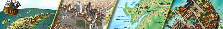
    Me too Matt! However, I just got a new commission, which will obviously get priority over my personal work. So it might take a while before I can go back to this one - I prefer to postpone it a little over rushing it and doing a bad job!

    Quote Originally Posted by DanielHasenbos View Post
    Prachtig werk! Nice to see it finished and the map looks great. With every project your work is getting better and better! I'm sure the greyscale version will rock too!
    We'll see about that in a bit I assume . Thanks a lot for your kind words Daniel!

    Quote Originally Posted by mat_r View Post
    This is great! I love how clear and readable it is without sacrificing its artistic quality
    And that's exactly what I was aiming for! Thanks a lot mat_r!
    Caenwyr Cartography


    Check out my portfolio!

  2. #12

    Default

    Really nice map! Love how you have done the mountains.

  3. #13
    Guild Expert Wingshaw's Avatar
    Join Date
    Aug 2012
    Location
    Usually Denmark
    Posts
    1,531

    Default

    Allow me to echo the others: this is a fantastic map, Caenwyr. Well done.

    I have one nitpick: the country borders. As others have said, they are very crisp and clean, which is good; I'm not a huge fan of the dashed line though. I think maybe a coloured line would be better, so the shape of the countries is more easily discerned (especially when zoomed out).

    But that's a minor nitpick; besides that, the map looks amazing--I love the strong colours

    THW


    Formerly TheHoarseWhisperer

  4. #14
    Community Leader Kellerica's Avatar
    Join Date
    Nov 2014
    Location
    South Scotland (originally Finland)
    Posts
    2,807

    Default

    Wow, you really outdid yourself with this one. The colors are beautiful, and the whole thing has a look of softness to it that I absolutely adore. Really, really great!

Page 2 of 2 FirstFirst 12

Tags for this Thread

Posting Permissions

  • You may not post new threads
  • You may not post replies
  • You may not post attachments
  • You may not edit your posts
  •