Page 3 of 7 FirstFirst 1234567 LastLast
Results 21 to 30 of 61

Thread: Ganador

  1. #21
    Guild Expert Wingshaw's Avatar
    Join Date
    Aug 2012
    Location
    Usually Denmark
    Posts
    1,531

    Default

    This is looking really good, Caenwyr. It has a very realistic design to it, and shows the Venetian influence that is clearly present in the story.

    THW


    Formerly TheHoarseWhisperer

  2. #22
    Guild Expert Facebook Connected Caenwyr's Avatar
    Join Date
    Apr 2012
    Location
    Flanders, Belgium
    Posts
    1,276

    Default

    Quote Originally Posted by Ilanthar View Post
    Still looking good . Do you plan to connect the city to the land with some big bridge? I'm just curious.
    I have certainly been thinking of that. It would help in moving cargo and building materials to and from the city, but it would also vastly lower the defensive capabilities of the city. As it is now, the city can only be reached by boat -- people from the mainland can use one of the ferry harbours on either side of the river mouth, and these can easily be pulled out or sunk if word reaches the city of an imminent attack. Defending or destroying a stone bridge is a lot harder, and while destroyin a wooden bridge is definitely a lot easier, I'm not sure a wooden bridge can span such long distances over salty, turbulent waters using medieval technology: the closest distance to the mainland is about 0.6 miles, or just about 1 km, which is only just below the current world record of 1.2 km for wooden bridges (and that one was built only in 1860, spanning a calm, freshwater lake).

    So yeah, considering that I don't think I'm gonna go for bridges connecting the city with the mainland, but I will certainly span some of larger distances with regular ferry lines.

    Quote Originally Posted by Josiah VE View Post
    This is mightily impressive. It's certainly not lacking in size.
    When zoomed out the design looks a lot like a real city.
    Haha, I guess that's the idea right?

    Quote Originally Posted by Voolf View Post
    Bunch of teeny-tiny squares and the effect is great. but i wonder if those small roofs wont merge into one clutter later when/if you are going to colour and shade. I am curious how you are going to develop it after lines are done.
    A good point, and well noted! I have been thinking the same thing actually. One thing I can do is thin out the linework a little bit (I've done this in the past with a simple mask), but the past few days I started dreaming of redoing the map entirely, but this time at least twice as large...

    This may sound like a ridiculous amount of extra work, but I've begun to notice the hardest work is getting things in the right place. The actual drawing is in fact quite fast. So if I decide to go and size it up, it'll be after I finished all the linework.

    On the other hand, the original idea was for this map to appear in my novel, which rules out anything larger than A4 (the current size of the image), so if I go for that, I suppose thinning out the linework is the best course of action here.

    To give you a quick idea of the effect, this is a section of the unaltered image:
    crop_unaltered.jpg
    and this is a quick-n-dirty masked version of the same area:
    crop_masked.jpg

    You'll notice there's a few spots where the masking could have been a little better, but that can always be tweaked manually. But all in all it's quite acceptable, especially if I'm gonna overlay it with colour layers anyway (these will make the distinction between different surfaces even more pronounced). So once this exercise of inking everything is done, I'm probably gonna throw a mask against it and be done with it.

    Quote Originally Posted by TheHoarseWhisperer View Post
    This is looking really good, Caenwyr. It has a very realistic design to it, and shows the Venetian influence that is clearly present in the story.
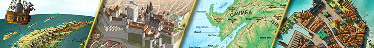
    Oh yes, Venice was a big inspiration here. The place has a ton of history, but unfortunately not much of it is taught in schools (or at least not when I was in school). The city itself is super crowded with tourists nowadays, so a visit generally ends up being a disappointment... but reading about the city and its history opened a world of imagination for me. Ganador has always been imagined as a city on a bunch of islands, all the way back to 2006 when I started writing, but it's only fairly recently that all this Venetian influence started creeping in.


    Alright, a smallish update for you guys!

    Like I wrote earlier, getting things in the right place takes much more time than the actual drawing, and especially so for small, irregular regions (such as all these itty bitty islands). The big challenge is to cram each of the islands chock full of houses and still keep the contours reasonably intact. I allow for somewhat larger infractions where there's docks -- there's no point in having my wharfs all wiggly and loopy, so straight-ish lines are the way to go in these places -- but where the houses go all the way to the water, I want the coastline to retain as much of its original squigliness as possible. Which isn't always easy with long, narrow buildings. But I think I managed to make that work.

    Ganador_09.jpg

    So, what do you think?
    Last edited by Caenwyr; 04-14-2017 at 03:05 AM.
    Caenwyr Cartography


    Check out my portfolio!

  3. #23

    Default

    Yeap, the masked version seem much better to process it later. Thumbs up. Good work so far.

  4. #24
    Guild Expert DanielHasenbos's Avatar
    Join Date
    Mar 2015
    Location
    The Netherlands
    Posts
    1,623

    Default

    Amazing work. I wouldn't want to have to draw a those tiny buildings! But you, sir, are pulling it off wonderfully! it's really a pleasure to watch this come together!

    Btw, in one of your first posts in your thread you mentioned that the landshapes were influenced by a part of the African coast. Is this the bit that inspired you?

  5. #25
    Guild Expert Facebook Connected Caenwyr's Avatar
    Join Date
    Apr 2012
    Location
    Flanders, Belgium
    Posts
    1,276

    Default

    Quote Originally Posted by DanielHasenbos View Post
    Amazing work. I wouldn't want to have to draw a those tiny buildings! But you, sir, are pulling it off wonderfully! it's really a pleasure to watch this come together!

    Btw, in one of your first posts in your thread you mentioned that the landshapes were influenced by a part of the African coast. Is this the bit that inspired you?
    It is, good sir! You have a keen eye for geographical features!
    Caenwyr Cartography


    Check out my portfolio!

  6. #26
    Guild Expert Facebook Connected Caenwyr's Avatar
    Join Date
    Apr 2012
    Location
    Flanders, Belgium
    Posts
    1,276

    Default

    Hi all,

    I finished the last inhabited islands. All that's left now is a few spread out settlements on the mainland and linework is done!

    Ganador_10.jpg
    Caenwyr Cartography


    Check out my portfolio!

  7. #27

    Default

    I love the stadium/jousting ring

    I don't know how you have the patience to do all these tiny buildings!

    Looking forward to the rest of it

  8. #28
    Guild Expert Facebook Connected Caenwyr's Avatar
    Join Date
    Apr 2012
    Location
    Flanders, Belgium
    Posts
    1,276

    Default

    Thanks Mouse!

    Since I'm very bad at actually finishing stuff, I suddenly decided to let the last remaining linework rest for a bit, and get some work done on the colouring of the water instead. It's not finished yet, but I thought I'd give you guys a sneak peak already.

    I intend to work with eight depth layers, five of which are displayed in this version. I'm working on the rest as we speak.

    Hmph. Now that I look at it, I'm starting to realise I'll have to tone down the contrast of these water layers considerably if I don't want them to overpower the main subject of the map: the city! But on the plus side, that means I won't have to worry to much about the somewhat sharp drop-off in the deeper parts, since it will get smoothed out anyway as I lower the opacity of the sea group. The silver lining, right?

    Also, I suppose the redness of the roofs will also help distinguish them from the blue hues of the water, so this is definitely no big issue.

    Ganador_10d.jpg

    What do you think?
    Last edited by Caenwyr; 04-19-2017 at 03:05 AM.
    Caenwyr Cartography


    Check out my portfolio!

  9. #29

    Default

    Oh WOW!

    You really know how to tickle the colour and pattern senses all at the same time!

    That is beauuuutiful

    And I don't think it will loose too much power if you reduce the contrast. The pattern itself is just screaming 'water' and 'mudflats' at me, and wouldn't need to be all that bold I agree

  10. #30
    Community Leader Facebook Connected tilt's Avatar
    Join Date
    May 2010
    Location
    Trelleborg, Sweden
    Posts
    5,784
    Blog Entries
    2

    Default

    beautiful water colors (hehe).. I clicked the map before reading your entry though (couldn't help myself) and was afraid that the ocean would overpower the city, but if you tone that down a bit and the city get equally power then it might just go along hand in hand...
    regs tilt
    :: My DnD page Encounter Depot free stuff for your game :: My work page Catapult ::
    :: Finished Maps :: Competion maps - The Island of Dr. Rorshach ::
    :: FREE Tiles - Compasses :: Other Taking a commision - Copyright & Creative Commons ::
    Works under CC licence unless mentioned otherwise

Page 3 of 7 FirstFirst 1234567 LastLast

Posting Permissions

  • You may not post new threads
  • You may not post replies
  • You may not post attachments
  • You may not edit your posts
  •