Reply With Quote
Great work GLS. Simple and clear, two features that are often forgotten in maps, but nevertheless very important. Great work!
Cheers,
Tainotim


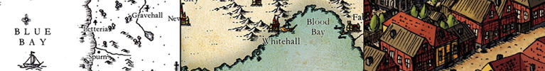
Here's a commission piece I recently finished for an upcoming series of novels. I haven't done a black and white map for a while and I think it came out quite well. I didn't want to crowd it too much given it needed to be fairly clear for print.
© Gregory Bennett 2017
Comments, rep and anything else always welcome.
Also, now it's done, I'll see what I can do with my Guild City stuff and the January challenge (eek, watching out for ChickPea's whip)
Last edited by Greg; 01-27-2017 at 01:57 PM. Reason: Forgot to put credit in
Great work GLS. Simple and clear, two features that are often forgotten in maps, but nevertheless very important. Great work!
Cheers,
Tainotim
What Tainotim said
Plus - really nice composition, GLS
Free parchments | Free seamless textures | Battle tiles / floor patterns | Room 1024 - textures for CC3 | GUILD CITY INDEX
No one is ever a failure until they give up trying
Very nice Gregory. The simplicity of the map makes it look very elegant. And those icons are quite tricky, but they actually work very well with the map. My only comment would be that I think the labels could all be under the icons. They might cover some of the features of the map, but I don't think it would be to bothersome. Great work!
-Dan
Thanks, Tainotim! I do have a habit of overcomplicating things sometimes and then not putting enough in at other times, so I'm pleased this one struck the balance.Originally Posted by tainotim

Thanks Mouse. The author gave me a nice outline shape to work with, so really all I did was tweak the coastlines a bit an deal with the title and frame.
Cheers Dan! I definitely will give moving the labels under a try and see hwo it turns out. It's not published yet, so I still have time.
Nice simple style GLS, I like it !

Really nice and clean, congrats on the commission. Like how the rhumb lines leads your eye outward. Nice job.
A very nice looking B/W map. Simple enough not to mess with my eyes that badly, so well done! The icons and text do seem a touch large, but then again, it probably will be printed in quite a small size, so I guess it makes sense. I do kind of agree with Dan on the placing of the labels, though.
Nitpicking aside, I really like how the map works all-in-all. It's simple, yet effective and well-suited for its purpose. I can easily imagine this printed on a novel. Some rep headed right your way!
Great work on this, GLS! As others have said, it's very clear and legible. I rather like the large labels and icons. They pop off the page and I think they'll be easy to read in all media. I've got an old Kindle (the first generation that was released in the UK) and some maps look terrible on it. I think this map would work well even on my Kindle because of the large, clear lettering and simpler elements. Nice work!
PS I may let you off for not working on the challenge since you were working on this nice map. Maybe....
"We are the music makers, and we are the dreamers of dreams"
 Posting Permissions