
Im looking forward to read about your Dominions history !


it's really a super fine job !
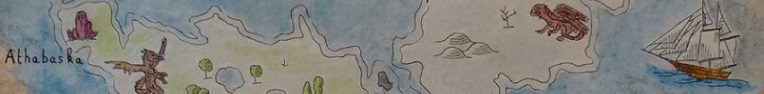
-- Maps and Watercolor --
In french :
Mon tipeee : come and support my work
https://mondelys.wordpress.com/ : Here I write and I draw the Encyclopedia of Lys
https://manaearth.wordpress.com/ : Discover the table rpg Mana Earth


Im looking forward to read about your Dominions history !
Labels always add a lot on a map and I love the look of them on this background. 'Was a good choice to make them simple : the hierarchy is perfect
I wonder how the boundary would look like with the same dark red you used for the icons ?


Thanks!Originally Posted by Narc

Yeah, I should probably get started on that, huh?
Thank you - I had the same thought. I'll try it out tonight. I also don't like the compass at all on second viewing; it doesn't go with the crispness of the landforms. So that's out too.
Whew. All done. I decided to keep the flowery outer border cause, well, I like it.
Some lore:
Kharbizar is a nation of exiles - both literally and geographically. Located on the far eastern shores of the continent of Estalen, the realm is a secluded place, bracketed east and west by imposing mountain ranges, in the south by the sea, and in the north by the vast wilderness of the Feywild. Founded nearly 1500 years ago by the immortal archmage Vurlus Khar, his small tower on the shores of Lake Tzal attracted scores of the native tribesmen, the Bizari, almost from the beginning. Seeking protection from the ravages of the wild Fey who haunted the northern and western forests, the tribesmen entered into a pact with Khar which has lasted a millennia and a half. In exchange for Khar's protection against the Fey, the Bizari donated a few of their strongest young men and women every decade or so. A small price to pay, really, and who cares if the Sovereign only comes out at night?
### Latest WIP ###
Looks good, Diamond. It may be too late to make changes (then again, you are running the voting...) but the one thing I'd suggest is making the lights/shadows on the shield a bit less strong and a bit less digital looking. Apart from that, this is looking great. I really like the border on this one, and the colour scheme, as always, is nice and subtle.
Wingshaw
Formerly TheHoarseWhisperer
Superbly 'Diamond'
Always fresh and crisp - just like a map really aught to be.
I wasn't really keen on the green to start with, but its definitely grown on me.
Free parchments | Free seamless textures | Battle tiles / floor patterns | Room 1024 - textures for CC3 | GUILD CITY INDEX
No one is ever a failure until they give up trying
Good point. I'm going to change the symbol a bit anyway, so I'll tone the beveling down on it too. As far as voting, I don't give myself any more or less time than the rest of you.
Thanks lady!
LOL!
Oops! typo in my comment there. 'aught' should be 'ought'. One letter wrong and a completely different meaning!
Free parchments | Free seamless textures | Battle tiles / floor patterns | Room 1024 - textures for CC3 | GUILD CITY INDEX
No one is ever a failure until they give up trying
Consider yourself grammatically reprimanded.
I changed out the coat of arms, but kept a lot of the bevel. Just didn't care for the way it looked without it. YMMV. I fixed the sidebar and title boxes too; put some texture over the key, etc.
### Latest WIP ###
Last edited by Diamond; 05-01-2018 at 12:16 AM.
 Posting Permissions