Reply With Quote


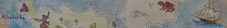
Great map, Nopkin! The drawing is excellent and the colors are really a treat.

Thank you, JO (for the rep as well)!Originally Posted by - JO -

Thanks for the rep, Ramah!
Glad to hear that you are seeing a great improvement. That's the result of me joining this amazing community of encouraging people. Thanks!
Thanks, Daniel! I think this should be one of the main characteristics of a fantasy map: lots of things to discover, the more the better. I do plan to work on that and make my future maps ever more "crowded"
Thanks again, Straf!
Thanks, Pixie (for the rep too). I'm glad you like your obelisk.
Thank you, Kelleri! Well, since this is the guild's map, not mine, I guess everyone can be whatever they want, regardless of what I think of both sorcery and cats
Thanks, Narc! For this one I've used Arches 100% cotton 300gsm paper and Schmincke Akademie watercolor. I think you should start with what you have, just make sure you are using some kind of watercolor paper, even if it isn't the most expensive (I've used Canson XL for a while). Also, don't get too preoccupied with the paints, as they don't make a very big difference in the beginning, in my opinion. The same with the brushes. Of course there is a place for artist grade paints and sable brushes, but I've come to learn that the single most important thing in watercolor is the paper and it makes a world of difference whether you are using good paper or not. However, don't let any of this stop you. Just go for the best paper you can find / afford and get your feet wet. Watercolor is a great medium. I'm still a beginner myself, but if you have any other questions, I'd be glad to help if I can.
Thanks, Beee! Glad that you like your mountains, I hope you'll have a good time there...
Don't compare your beginning with someone else's middle
My Instagram: Mr.Nopkin ॥ Mostly maps and calligraphy
Great map, Nopkin! The drawing is excellent and the colors are really a treat.


Thank you Nopkin to answer me.
I'm agree, the paper is my first problem. My watercolors cost me 15€... i still think that i can have better
I will continue to work watercolor and learn how draw montains and forests, and trees, and... make maps.
-- Maps and Watercolor --
In french :
Mon tipeee : come and support my work
https://mondelys.wordpress.com/ : Here I write and I draw the Encyclopedia of Lys
https://manaearth.wordpress.com/ : Discover the table rpg Mana Earth
Always love some hand painted mappery and this is very wonderful. Great job!
When its over and you look in the mirror, did you do the best that you were capable of? If so, the score does not matter. But if you find that you did your best you were capable of, you will find it to your liking. -John Wooden
* Rivengard * My Finished Maps * My Challenge Maps * My deviantArt
Sorry for my lateness. Where can I buy my fan club membership ?
Great map with nice paint-looking style
New Horizons
Fantasy maps and illustrations.
All my non-commisioned maps are FREE for personal use. Get them at my home page New Horizons
Get more of my maps by becoming my Patreon.
Support:
Patreon | Tip via PayPal.Me | Buy Me a Coffee
I really like this one! Your watercolours are improving at full power nopkin!
Keep going!!

This is great! I love the texture from the watercolor, I need to play around with those more.
This is so awesome, it is hard to find something that could be improved, but I think the water around the ships could look a bit more watery. It looks a bit like some of the ships might have become stranded on grassy islands. I think it's the way that you've built up under the ship, rather than more generally around it, and the color seems to be greener than the sea in general. It's not something I noticed looking at the map as a whole, but it did become obvious once I started looking at the ships specifically. The ships themselves look great, as does the illustrative detail in general.
Thanks a lot, Ilanthar!
Perfect, that's the right attitude
LOOOOL, Thomas! You're too kind!
Thanks, Voolf (for the rep too)!
Thank you, MMM! I do plan to keep improving, although from now on, the pressure is getting higher...
Thanks for the rep and your comment! I got inspiration for the water around the ships from a couple of old maps in an atlas I have. They looked great there and I tried to mimic that, but those maps were in a different style. So I totally agree with you, they do look somewhat off on my map, and it's helpful to hear that from somebody else too. I am trying to be more conscious about the decisions I'm making and strive for a more cohesive look with my maps, so your point comes at the perfect time. Thank you, I appreciate it a lot!
Don't compare your beginning with someone else's middle
My Instagram: Mr.Nopkin ॥ Mostly maps and calligraphy