Page 3 of 3 FirstFirst 123
Results 21 to 29 of 29

Thread: Bréistyn's Folly - the Sværian Age (an experiment in globe cartography)

  1. #21

    Default

    I like the attempt without the linework, and I usually lean toward linework myself.
    I think it gives a cool, ethereal feel to it.
    It's still a hybrid, with the linework for coasts, which some will find incongruous. Maybe.
    I still like it for the attempt at new styles.

  2. #22

    Default

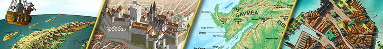
    I agree with J.Edward - I think you have a really cool feel to the map here, like we are looking down on a real world from above. I love the terrain as it is, without the linework. Way to go keeping all the mountain shading consistent with the local perspective, by the way! But the coastlines are a little incongruous, as are the graticules on the globe. (That's not to say they're bad, it's just my opinion!)

    Maybe you could try lowering the opacity on the coastlines, if not removing them altogether? The graticules might be fine with lower opacity. I think the rivers are OK because they still look like part of the image.

    Another thing you could do to really push the satellite view is add specular sunlight glints on the water and include some clouds. THere are lots of photos from the Space Station you can rely on for inspiration, such as this one.

    Of course, my suggestions are going in one direction, but others are fine, too! Are you planning to add more map features on top of the image (cities, roads, etc)?

  3. #23

    Default

    Wow! Truly awesome, looks like both a painting and a map, with the line without line weird thing, a drawn version of Google Earth. Maybe you could change the hills/dunes in the middle desert, but still really nice.

  4. #24
    Guild Expert Guild Supporter aeshnidae's Avatar
    Join Date
    Apr 2017
    Location
    Washington, DC
    Posts
    1,011

    Default

    This is wonderful, Caenwyr! The more I look at it without the line work, the more I like that version. At first I strongly preferred the line work but I've changed my mind. My only recommendation is to consider decreasing the opacity of the line work for the coastlines. The perspective is fantastic.

  5. #25
    Guild Expert Facebook Connected Caenwyr's Avatar
    Join Date
    Apr 2012
    Location
    Flanders, Belgium
    Posts
    1,276

    Default

    Hey all! Thanks a bunch for all your cool feedback!

    I continued work on the piece over the past few days, and have also started labelling it.

    I also messed around with cosines to get everything exactly right. Basically I drew a grid on the globe, and traced rings on it going from the center (0°) all the way to the edge (90°).
    • for the city icons, I used the following formulae:
      • width = 20 pixels * cos(x)
      • height = 20 pixels * cos²(x)
      • this causes the icons to flatten as they get closer to the edge, AND they diminish in size (until both width and height reach zero at the edge)

    • for the labels I used a similar method, but I decided to keep a certain minimum size at the edge (half the centre size instead of zero), so the formulae altered a tiny bit:
      • cities font size = 4 * cos(x) + 4
      • countries font size = 8 * cos(x) + 8


    In all formulae x is the distance between the icon/label and the centre of the globe, measured in degrees. So at the edge x = 90°, and in the centre x = 0°.

    Click image for larger version. 

Name:	Bréistyn's Folly (10b).png 
Views:	77 
Size:	5.63 MB 
ID:	110748

    Thoughts are welcome as always!
    Caenwyr Cartography


    Check out my portfolio!

  6. #26
    Guild Artisan Warlin's Avatar
    Join Date
    Oct 2015
    Location
    Montpellier (France)
    Posts
    620

    Default

    Spectacular, Caenwyr !
    It's a pity that the borders hide the work done on the mountains, you can perhaps try to make them a little more discrete ?

  7. #27
    Guild Expert
    Join Date
    Jan 2016
    Location
    Canada
    Posts
    1,499

    Default

    The map is beautiful caenwyr, but you’re really taking away from it by putting a line right through those gorgeous mountains.

  8. #28
    Guild Expert Eilathen's Avatar
    Join Date
    Aug 2007
    Location
    Kurald Liosan
    Posts
    1,335

    Default

    Yes, i have to agree here. Love the overall feel, the colors are awesome but the border-lines are really wrecking the whole feeling for me. Do you really need border depiction for this map?
    I'm trapped in Darkness,
    Still I reach out for the Stars

  9. #29
    Guild Expert Facebook Connected Caenwyr's Avatar
    Join Date
    Apr 2012
    Location
    Flanders, Belgium
    Posts
    1,276

    Default

    Hey peeps! You're all obviously right - those borders are cra... well, let's just say, not very awesome.

    So I went ahead and redid them, showing just the parts that don't overlap the mountains this time. It's not the first time we're having this discussion: what do you do when the borders run along the mountains? I haven't found a decent way of displaying-yet-not-actually-drawing them, but this might be a valid option.

    Then again, this is mostly a practice map, and I learned one thing from it: I can actually do top-down mountains! Woot!

    Click image for larger version. 

Name:	Bréistyn's Folly (12).png 
Views:	66 
Size:	5.60 MB 
ID:	110829
    Caenwyr Cartography


    Check out my portfolio!

Page 3 of 3 FirstFirst 123

Posting Permissions

  • You may not post new threads
  • You may not post replies
  • You may not post attachments
  • You may not edit your posts
  •