That is a crazy color scheme, but it works to give a unique feel to things.


Clever. I like it...
That is a crazy color scheme, but it works to give a unique feel to things.
GW
One's worth is not measured by stature, alone. By heart and honor is One's true value weighed.
Current Non-challenge WIP : Beyond Sosnasib
Current Lite Challenge WIP : None
Current Main Challenge WIP : None
Completed Maps : Various Challenges
### Latest WIP ###
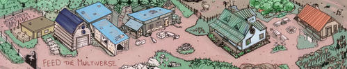
This one is pretty close to All-But-Labels done. I can't decide if I like the title box, but I think it's at least headed in the right direction.

My business website: https://www.greatwhitenorthcartography.com/
My full cartographic portfolio: http://cargocollective.com/BodennerC...phic-Portfolio
My Patreon account: https://www.patreon.com/user?alert=2
I like the spooky color scheme. It seems as if the map is being viewed in nighttime conditions rather than the day, which is kind of fun. One thing I noticed however is that, aside form the stone work the inset images are a little difficult to read, owing to the fact that the values and colors of the house materials are so close to those of the ground and background of the inset. I imagine if you lightened the buildings and/or darkened the bacgrounds a tad, or added some lighter highlights to the rims of the buildings this would solve the problem. It's a fun map.
Cheers,
-Arsheesh


Oooh, you've returned to this color scheme! Loved it on the Dusken Coast map (it's been in my Inspiration folder since you posted it), and love it here! Looking good.
Last edited by Kellerica; 10-22-2019 at 06:32 AM.
### Winner ###
Alright, I think this one is just about ready. It's been a great challenge!
Last edited by ChickPea; 11-18-2019 at 05:01 PM. Reason: Added winner tag
My business website: https://www.greatwhitenorthcartography.com/
My full cartographic portfolio: http://cargocollective.com/BodennerC...phic-Portfolio
My Patreon account: https://www.patreon.com/user?alert=2
Oy this has got my vote, killer work all around.
The color scheme you've used really sets a spooky atmosphere.
Cheers!
IR
Very nice color scheme.
Click my banner, behold my art! Fantasy maps for Dungeons and Dragons, RPGS, novels. No obligation, free quotes. I also make custom PC / NPC / monster tokens.
Contact me: calthyechild@gmail.com or _ti_ (Discord) to discuss a map!
Is it too late to change my color scheme to match yours?
Great map!!
Del
Great work! The color scheme (especially the purples) really give the map a dark twilight realm kind of vibe. I'd hate to be the one to get lost in the swampy Dark Warren!
 Posting Permissions