
 Reply With Quote

Oops, I saw it firstly in the Guild Participation room and had no idea you already posted it there. I can just rewrite what I said there : wonderful work, wonderful map, and congrats for finishing it ! ^^


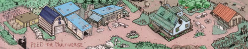
This map looks fantastic. I personally like the simple and clean style of these mountains. I also really like your color pallet and the style of the border. May have taken a long time but it was worth it. ��
- Josh
Oops, I saw it firstly in the Guild Participation room and had no idea you already posted it there. I can just rewrite what I said there : wonderful work, wonderful map, and congrats for finishing it ! ^^
Kell, you really outdid yourself ! It's an amazing piece of art !


Hmm, I see, I see... I do suppose it does partly fall down to aesthetic preference with these types of maps, but you've certainly made good points. I'll definitely keep your comments in mind, thanks for taking the time to type this out, I really appreciate it!Originally Posted by Eilathen

Thanks!
Thanks, man. Glad people are enjoying the border, I've never made one like this before.
Thank you!
Thanks, glad you think so!
Thank you! I'm tempted to think it was worth it too, but still. Could've gotten it done sooner. Well, in a perfect world and all that...
Twice commented and twice appreciated, thank you again! Always glad to see comments from you, B. ^^
Oh, thank you so much! I think this is one of my better ones for sure, if I dare say so myself.
Last edited by Kellerica; 01-13-2020 at 06:48 AM.
The lettering is really cool.
Click my banner, behold my art! Fantasy maps for Dungeons and Dragons, RPGS, novels. No obligation, free quotes. I also make custom PC / NPC / monster tokens.
Contact me: calthyechild@gmail.com or _ti_ (Discord) to discuss a map!
Awesome map! I love the colors, the frame (those emeralds!) and above all, the "Kellerica" flavour of the map itself
.
Beautifully done Kell. It really paid off taking things slow. This is one of your best imho and the border is crazy good.
Btw. i got my eyes on that south sea
New Horizons
Fantasy maps and illustrations.
All my non-commisioned maps are FREE for personal use. Get them at my home page New Horizons
Get more of my maps by becoming my Patreon.
Support:
Patreon | Tip via PayPal.Me | Buy Me a Coffee
Everything is so crisp to the eye, a really nice piece you've finished (finally), Kell. The border and choice of colors are just so fitting.
I enjoyed the short jaunt into the history of the island as well, really cool stuff!
IR
Thank you, everyone! I'm so glad this has been so well received.
Beautiful map, with many great visual ideas.
The circles with the names of the isles and seas, the short story of the isle, it's nice and clever.
The colors, while simple, look harmonious and fit perfectly the overall feel of the map.
Very well done !
 Posting Permissions