Results 1 to 5 of 5

Thread: Map of the Dream Mountains

  1. #1

    Map Map of the Dream Mountains

    I recently finished up this map. I started it as a frustration outlet, then it became good training and, since I couldn't grow dissatisfied with it, I just finished it. :D It's mainly 14h of work, 16h if you count the polishing it up. Any feedback appreciated!

    There's also a SVG version right here!

    Attachment 120491
    Attached Thumbnails Attached Thumbnails Click image for larger version. 

Name:	map2.png 
Views:	197 
Size:	1.77 MB 
ID:	120492  
    Last edited by Eowyn Cwper; 02-20-2020 at 08:56 PM.
    My website (commissions open)
    My LinkTree (to find me everywhere)

  2. #2
    Guild Journeyer Yrda's Avatar
    Join Date
    Feb 2020
    Location
    Germany
    Posts
    127

    Default

    I guess I can't say anything professional about (especially) modern maps, but I like the color palette. And now I'm wondering if there are standard color palettes with precise color values you should use if you want to draw a realistic map.
    How did you choose yours?

    Then I'm wondering - where is this place you've mapped here? As a roleplayer and consumer of fantasy literature, I thought maybe this is a map of an area in a fictional world. But then I saw the svg is hosted on wikimedia commons. You find me irritated.

    Which software did you use for drawing your map? Of course the pencil doesn't create the art, but I always find it interesting what tools others are using.

  3. #3
    Community Leader Kellerica's Avatar
    Join Date
    Nov 2014
    Location
    South Scotland (originally Finland)
    Posts
    2,807

    Default

    I love how detailed the elevation looks. Nice stuff! Not entirely sold on the colour scheme, but everyone knows I like my maps a bit dark and bleak, so pay me no mind...
    Homepage | Instagram | Facebook | Artstation
    Just give me liquorice and nobody gets hurt.

  4. #4
    Professional Artist Tiana's Avatar
    Join Date
    Oct 2009
    Location
    Winnipeg, Manitoba, Canada!
    Posts
    1,768

    Default

    Personal preferences of another artist should not be taken as anything other than a potential for inspiration, of course. For me, I love the color scheme, it's superbly modern and suits the map style without a doubt. I also love Kell's moody schemes. They all have their uses to present different feelings. You should be proud of the outcome, and if you're a younger person without a career direction yet, I'd consider learning more about GIS, that's a beast of a program but I think you'd find yourself making some excellent real life mapping in time and potentially become quite valuable as a cartographer. Your natural eye for a modern color scheme would make you a natural for a contemporary mapping project if you had the knowledge to work with cartographic data as well. Obviously many of us here produce maps with very different moods than you're presenting and it's really neat to see this topographic style represented in fantasy mapping for a change. I mean, I love old maps, that will never change, but you're clearly quite talented at this, a natural if this is what you started with... I assume you had prior experience doing vector art before trying a map out though! You don't just pick up Illustrator and turn out that on your first go, 14 hours or not.

    The only thing I'm unsure of is the Anglicization of your conlang with that crossbar l in there. That's way too advanced of linguistics for the average reader, it's not even in the IPA, and, the sound represented by that symbol is so close to a standard l it hardly seems worth distinguishing except to show off just how much you know about linguistics. When people start doing stunts where I have to stop reading and do 15 minutes of research to figure out what they meant to represent, well... that's when I stop reading. I always look at maps first and seeing symbols like that in a conlang would make me put the book back down since I would feel I wouldn't be able to get in the zone with it. That's not to say you can't have obscure non-English sounds in a conlang. I have watched multiple videos, listened to several sound files, and I still haven't got a clue how I would make that Plollin (sorry, I don't know the code to make the symbol) come out of my mouth. I think what you're aiming for is like, the tongue slides forward as you keep making the same sound, but I'm not sure, and if that place was regularly mentioned in the book, it would torment me so much I would probably stop reading. And since I couldn't make the symbol on my keyboard easily I wouldn't be able to easily search it if I didn't know to go to the IPA to start.

    I too have an obscure sound in my conlang. It's a dɮ, I did not realize it was as rare as it is when I started using it ni my conlang, but, I spell it "dl" so people actually know more or less what sound to make. Of course the crossbar l does somewhat represent the sound it makes, but I think if I included it in a language, I'd spell it as hl. Phlohllin would be a monsterous town name and English speakers would always end up with a f sound. So maybe ll, Pllollin but then any linguists might think you meant a voiceless click... tricky beast. Accents over vowels don't bug me much. The accented s... well, that also took a bit of research to figure what was intended. I would Anglicize it as esh, but I think that one you could easily just drop in a pronunciation note in the legend and people would understand that the accented s = "esh" sound. Assuming you're going for Polish, the ɛɕ sound, and not Lower Sorbian which is just ɕ and I feel like at that point there's no good excuse to not just spell it "sh" for an English audience. It apparently only exists in three languages, the other being Saanish, a language I haven't even heard of before, where it's pronounced ʃ. This to me tells me the accented s is a poor choice because it isn't even pronounced the same way in the 3 different languages where it exists, but, hey, maybe you really wanted to invoke Polish.

    The double l with one crossbar l and one regular l... I don't know if you could easily explain it in non-linguist terms. It's visually appealing, but a hiccup. Now, the L with a bar is also used in Polish, but of note, in Polish that symbol makes a w sound, and I don't think an English reader is going to jump to that conclusion, so it would be better suited as a w. I don't see w in use so it wouldn't overlap. That would leave you with Pwolwin. It isn't used in very many other languages either, all of the others fairly obscure, Polish being the most noteworthy. I would include an explanation if you mean for it to = a w sound, since there is only one language in the world that I can find where that is true (seems the rest of them are the "dark l" with the different tongue position).

    I have no idea if deviating into conlangs is entirely appropriate on the cartographer's guild but y'know it looks like you're into them so I figured it might be worthwhile feedback if this language is your creation. If it's not, well, what can ya do.

    But yeah, it's not that you can't use sounds that aren't in English, even relatively obscure ones. Just make sure that if you present your work in English, it's understandable.

    The map itself is grand and mostly quite easy to read. There are a couple of places where the dark lines underneath the text chew it up a bit. It's workable but it wouldn't hurt to keep in mind a bit of negative space around the text, or a stroke. This is mostly limited to the small mountain text. I would probably choose a glow underneath but I don't know if that really suits the style, I'm sure you can fuss with it a little and improve it if you wanted.

    I can tell a lot of work went into the mountain design, and the result is excellent. I am only giving feedback because you requested it in your post, and I would say these are quite small complaints mostly based around its ultimate usability as a piece of graphic design to pull people into that world. If you love the visual aesthetic of your conlang Anglicization, I understand, I think the addition of a small pronunciation legend is the best choice to support the use of those symbols. Otherwise it does look quite finished, I would expect to see such work in an Encyclopedia of that world.

    Click my banner, behold my art! Fantasy maps for Dungeons and Dragons, RPGS, novels.
    No obligation, free quotes. I also make custom PC / NPC / monster tokens.
    Contact me: calthyechild@gmail.com or _ti_ (Discord) to discuss a map!


  5. #5

    Default

    Quote Originally Posted by Yrda View Post
    And now I'm wondering if there are standard color palettes with precise color values you should use if you want to draw a realistic map.
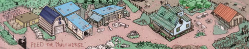
    Probably! There are probably recommendations as well, but I like to do things my own way. Also, I'm pretty bad with colors (although you're not the first person who praises my color palette for this map, so it's pretty confusing for me!) and I like to start from scratch as training. Long story short: I spent a long time adjusting colors back and forth, imitating what I'd been seeing for actual maps. I also took inspiration from another map I made in August 2018 whose color palette I improved.

    Quote Originally Posted by Yrda View Post
    Then I'm wondering - where is this place you've mapped here? As a roleplayer and consumer of fantasy literature, I thought maybe this is a map of an area in a fictional world. But then I saw the svg is hosted on wikimedia commons. You find me irritated. :)
    It is a fictional world. ^^ It's mostly bits of ideas for my conworld that I put together on that map; it won't be part of anything bigger but maybe this forum will give me the incentive to finish up the actual full map of my conworld. :D It's hosted in Commons because it's the safest-looking SVG-compatible file host that I know of. It shouldn't be used for personal artworks but I'm a Wikipedia admin so people don't tell me off, but shhh.

    Quote Originally Posted by Yrda View Post
    Which software did you use for drawing your map?
    I'm an Inkscape aficionada. ^^


    Thanks Kelle! I honestly believe I have a lot of progress to make with colors, but Hell, I gotta find my own style too. :D


    Quote Originally Posted by Tiana View Post
    I'd consider learning more about GIS
    I'll certainly keep that in mind!

    Quote Originally Posted by Tiana View Post
    I assume you had prior experience doing vector art before trying a map out though!
    I always was a fan of the realistic map style. I think it's quite different from fantasy-looking archaic styled maps in the creative process it involves because I'm quite unable to make a map in these styles. And I literally can't draw anything else than maps (that's why the verb “to draw” doesn't fit me in my opinion).
    This is like my 6th or 7th “serious” mapmaking project. I've been messing up with Inkscape a lot for 4~5 years, mostly to design banners and logos for my own use, but I wouldn't dare to call it “creation” and I acquired most of my experience with the software over the last 2 years.


    About my conlang. I'm well-known (relatively speaking) in the conlangsphere for my awful romanizations and etymological spellings. :D Strangely enough, it weighs more when someone tells you elsewhere that it should be improved. Ironically, this was already a simplified orthography, with fewer non-English characters and etymological traces. By the way, everything is justified etymologically. The ‹ł› represents a /x/ sound (the spanish jota) with a [ç] allophone (German “ich”) which comes from an etymological /ʁ/ (the French and German R sound) which in turn comes from an etymological /ɫ/ (English dark L). ‹ł› for /ɫ/ is what conservative Polish dialects (that haven't turned it into a /w/ sound) still use. It's also inspired from the Armenian romanization which has ‹ł› for /ʁ/ to this day. My conlang has much worse though: what about ‹bl› for /ɫ/? :D

    Okay, I'm driveling. I will definitely make the romanization more English-compatible and I'll get back to you in a couple d---

    Oh, look, I've made it already.

    Code:
    aië/ai
    oië/oi
    td/t
    kg/k
    pb/p
    cc/c
    c/th
    ë/i
    ii/í
    ö/y
    yy/ý
    ä/a
    oh/ó
    ah/á
    eh/é
    ih/í
    yh/ý
    uh/ú
    w/v
    ł/h
    pl/ł
    bl/ł
    sz/sh
    ś/sh
    z/ch
    This should change the fully etymological spelling (which, so far, your eyes have been kept safe from) into a reasonable romanization. This should be visible in my signature from now on – only one change made, but it's a final Easter egg because ‹ś› (now ‹sh›) stands for… a regular /s/ sound. ‹s› is /ɕ/. I'm sorry. :( It's etymological. :(
    Darn, I hardly know you and you've just changed the æsþetic of a two-year long project in just one message. :D And I'm happy you did!


    Quote Originally Posted by Tiana View Post
    There are a couple of places where the dark lines underneath the text chew it up a bit.
    I have to say I have no idea what you're referring to. :o


    Thank you for the tremendous amount of time you put in your feedback!

    › Wyn
    Last edited by Eowyn Cwper; 02-22-2020 at 12:17 PM.
    My website (commissions open)
    My LinkTree (to find me everywhere)

Posting Permissions

  • You may not post new threads
  • You may not post replies
  • You may not post attachments
  • You may not edit your posts
  •