


Oh, boy, a chance to talk about my favourite mapping thing!
For me, it's both. My texture layers - and there is a lot of them, usually 6-10 per map at the very least - are located in the middle.
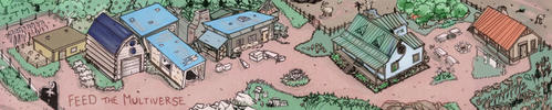
I'll use my Huly's Rest map to demonstrate some of the things I'm talking about here. Here is the finished product, to those who are not familiar with it.
My layer structure for maps roughly goes like this (the capital letters indicate layer folders), from bottom to the top:
BASE
This is where my Background/Ocean layer and the landmass mask are located, alongside with various other effects. Most of the other things are coastline and/or ocean related. Wavelines and/or outer rings around the coastline, inner glow for the coast and suchlike. I should note that these days I automate almost none of this, so this folder already includes several hand-painted layers of brushwork.
This might also be the first place I'll add little texture to. Nothing too wild, and not on every map, but sometimes I like to play a little with seamless texture patterns here. A low opacity Pattern Overlay style applied to the sea layer, or a separate one above that with some sort of a cool pattern can help thing look more alive when more texture gets added later.
LA
This is the freehand lineart for the map. Separate layers (or occasionally subfolders) for Coastline, Mountains, Forests, Rivers, etc. etc.
TEXTURES & ADJUSTMENTS
This is where the magic happens. Texture layers with varying transparency settings (99% of the time Multiply, Overlay & Soft Light are what make up the mix) and varying opacity procents. I have a large collection of textures, but honestly I have maybe 10 trusty ones I end up using on almost every map. Most of these are from Shutterstock (yes, I'm apparently the type of person who's willing to pay honest-to-god money to obtain pictures of stained papers, and I'm not completely sure if I'm OK with knowing that), with an addition to a few ones from CoyoteMax's amazing sets.
Here is what Huly's Rest looks like with no textures.
The textures are followed by - and this is the most important thing - a crapload of colour adjustment layers. When you work with as much texture as I do, you can't even think about not using these. Most of the textures tend to be pretty yellow/beige in hue, and when you have 10 of them on top of each other, the tone of the map is going to look disgusting no matter what colours you try to give to the layers underneath. That's why I let the adjustment layers to do the basic colouring for me.
I usually start with a Levels or Curves layer, to turn the brightness up a notch as having all those textures piled up makes things look very murky. I often like to give the contrast a little boost too, as I generally like how that makes everything look.
I then proceed to do actual colouring. Most of the time I use Hue & Saturation (both with 'colorize' tagged and without), or Color Balance (I usually only use this when I want the overall colour scheme to still be parchment-y sepia tone, I use this to bring the blues out to combat the yellowness of the textures) I use the mask from the Base folder's landmass layer, and create separate adjustment folders for land and sea. These can include up to 5 separate adjustment layers each, as I often need to pile them up in order to get the kind of shades I want. This can take a lot of time and tweaking.
Just to give you an idea of how much of this is going on in my maps, here is how Huly's Rest looks with the exact textures the finished product has, but with the colour adjustments disabled.
SHADING
This is a folder that includes the shading for mountains and other things. In the past I used to put this layer beneath the textures, but these days I find myself putting it on top of them more and more. When doing the shading, I almost always end up using the Overlay blending mode for the layers, because it tends to create really beautiful shades against the texture. Now, a few things to note: I always use basic black when painting the shadows, drop Fill of the shading layer to 0%, add a Colour Overlay layer style (with Overlay blending mode), rather than just the layer itself. This because it makes it so much easier to tweak the colour of the layer until I find the perfect shade. And again, subfolders are my friend here - I often need more than one layer of shading for mountains, for instance, so I create one folder for them all. This way, I can apply the needed layer style to the whole folder instead of the individual layers, which just makes life so much easier.
PAINTWORK
These would be the the additional brushwork I want to do to give the map more of a painted look. In my latestet Adria reborn map, I put a lot of effort into paiting the water around the coastlines, and a huge majority of those layers existed above the textures. Again, I'll use bleding modes like Overlay or Soft Light to make them bleed nicely onto the texture (remember what I previously said about using Colour Overlays for easier tweaking), and just pile a insane pile of them on top of one another. When I think I'm done, I'll add one more handpainted layer just to be safe.
TEXTURES, VOL 2.
Yeah, this is something I find my maps having more and more often. I'll end up adding a couple of more textures on top of everything, usually in blending modes like Colour Burn (low opacity) or Multiply (maybe a bit higher opacity with this one), together with one or two minor adjustments. It's usually upon adding these that I start to find the colour theme I really want for this map to have. What can I say, I love using texture.
LABELS
Well, what the title says, really. Once more, the layer styles panel is the king, subfolders are my friends and slightly transparent labeling and fuzzy look makes them bleed nicely into the texture. These are usually the last thing I add, alongside with small additional decorations.
Some final thoughts (and I should stress that this is of course my personal view and not some gospel truth):
If you are thinking of texture work as something that you do as a separate thing, after or before painting the map, you are approaching it wrong. Working with the textures is woven into the process of creating digital works like these, and in order to get the painting to look like you want, you'll want to start adding the textures in as early as possible. In my opinion, you need to have the textures present before you start painting, as you must paint to fit the textures as much as to adjust the textures to fit with you painted alements. You can use them underneath your linework, above it, or both, your choice.
Make use of the amazing variety that Photoshop's blending modes and adjustment capabilities, and take some time to look for good textures to make your work easier.
So there you have it, my quite-a-bit-more-than-two-cents on the matter. This stuff is my crack, and I may well be making things a bit more complicated for myself than is maybe needed, but hopefully this will give you at least some ideas. Please don't hesitate to ask if there is anything you'd want me to elaborate on - I'm not the best at explaing this stuff, but I'll do my best to clarify.
Textures, man. Textures are so darn great.

 Reply With Quote
 For most of the time, I have no idea how I've done the things I've done on maps, which can get kind of awkward when someone asks me to do a commission "in the exact style as your previous XX map" and I'm there trying to explain why I might not be able to do it...