
 Reply With Quote
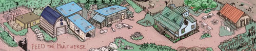
Update – the main challenge is to not make it look too cluttered, and I can't make it any bigger because it's planned for a 9×6in book. And not everything is on there yet. -sweats in French-


Hello guys, here's a WIP of my current commission. It's posted with permission and I'm here looking for critiques, opinions and ideas! Questions too. :þ

My website (commissions open)
My LinkTree (to find me everywhere)
Update – the main challenge is to not make it look too cluttered, and I can't make it any bigger because it's planned for a 9×6in book. And not everything is on there yet. -sweats in French-
My website (commissions open)
My LinkTree (to find me everywhere)


Looks good. You pulled that together fast.
If you're going to be doing a 2 page spread, put a 50% vertical reference line down the middle and make sure that no text will be cut in half, it looks like Heron and Andris might be cut in half or separated from their stars. If it's 1 page, don't worry about it.
Make an adjustment layer that converts it into black and white so you can be sure that it will convert well to the book. For the b/w conversion, you may have to significantly reduce the darkness of the starfield background, and add a stroke around the text. You will want to make sure that the star coloration that goes around the binary and trinary systems shows up in how you adjust for the BW print. I like how you handled it... in color... I'm not sure how that purple will adjust for the print though, so definitely slap the adjustment layer on it now and tweak the way it goes white or black to see if it turns out okay.
Click my banner, behold my art! Fantasy maps for Dungeons and Dragons, RPGS, novels. No obligation, free quotes. I also make custom PC / NPC / monster tokens.
Contact me: calthyechild@gmail.com or _ti_ (Discord) to discuss a map!
Hi Tiana.It's going to be printed on one page.
I've never used an adjustment layer before and I'm not sure how it's supposed to work. Maybe colouring the binary and ternary systems is not the best of ideas anyway?

My website (commissions open)
My LinkTree (to find me everywhere)
Hm. I like the color better, but the square will probably pop more.
So, adjustment layers allow you to have something like, say, a total desaturation over top of your image without destroying the art to do so. In Clip Studio Paint, it's "Layer / New Correction Layer / Hue-Saturation" to make it black and white. In Photoshop, I thiiink it's called an adjustment layer, and the black and white choice gives you the ability to set how black or how white each color will go... but this adjustment layer still acts like its own layer, which you can turn off and on again. You'll want to learn how to use these if you do any sort of photo editing.
Basically, here's the difference between just desaturating, and using the Photoshop black and white adjustment layer to determine how black and how white each color gets. (Desaturation alone on the left, Photoshop version on the right)
You'll see how this makes a key difference in how the 'red jagged border' pops out, and how well the nebula is visible. You will also see that once this is done, the grey text starts to become harder to read, and in print, will get entirely lost if you don't give the B/W version a white stroke or black stroke to force contrast.
Last edited by Tiana; 08-05-2020 at 09:32 AM.
Click my banner, behold my art! Fantasy maps for Dungeons and Dragons, RPGS, novels. No obligation, free quotes. I also make custom PC / NPC / monster tokens.
Contact me: calthyechild@gmail.com or _ti_ (Discord) to discuss a map!
Oh, I've already done that. Only, in Inkscape it's just a filter, not a layer. Here's the image without the “hue to black” filter. Illegible, isn't it?
Are you saying it should be even darker then?
Last edited by Eowyn Cwper; 08-05-2020 at 11:47 AM.
My website (commissions open)
My LinkTree (to find me everywhere)
Update time!

My website (commissions open)
My LinkTree (to find me everywhere)
I reverted to coloured halos for the binary and ternary systems.

My website (commissions open)
My LinkTree (to find me everywhere)
I like that version very much. The squares were a good idea, but now it is looking much more "natural" and smooth. However binary and ternary systems can be realized instantly. In sum, the map is looking both informative and stylish to me and I would definitly buy that, if it was my project
Yeah, I like the colored rounds better too.
Click my banner, behold my art! Fantasy maps for Dungeons and Dragons, RPGS, novels. No obligation, free quotes. I also make custom PC / NPC / monster tokens.
Contact me: calthyechild@gmail.com or _ti_ (Discord) to discuss a map!
 Posting Permissions