Reply With Quote

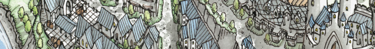
Very nice work and quite an original style! If I may, I would just play a bit more on contrast to make the lands pop a tad more (maybe somewhat brighter lands?).


Been a while since I've worked on anything mapping related. Working on the tectonics, geography and climate for my conworld was definitely a worthwhile effort, but it was pretty taxing. For the time being I want to focus on the more creative side of mapping. I feel like I took the tectonics and climate as far as I wanted for my conworld.
So here's my first map proper! Total time I spent on this is somewhere between 50100 hours. The actual map was drawn in Krita, and labels were added in Photoshop (Krita's text tool is not that great). The map itself is a small section of my previously constructed world.
This was first and foremost an exercise in developing my own style. I wanted to see if I could do away with line-art entirely and still create something that looked clean and precise. Colour selection played a big part in the design process.
This was a fun project and very rewarding. I'd love to hear your thoughts!

Very nice work and quite an original style! If I may, I would just play a bit more on contrast to make the lands pop a tad more (maybe somewhat brighter lands?).
I really love this style! But I think Ilanthar is right, that lightening the values of the land a bit will help.
DeviantArt: https://www.deviantart.com/turambar91
Thank you, Ilanthar! You're right, especially the bottom islands get lost against the ocean. I'll probably do a combination of lightening the land and darkening the ocean colour as well.Originally Posted by Ilanthar

Thanks a lot! It's always good to get fresh eyes on these things.
The inkless look is amazing. So clean, and yet has the information needed to tell the story and still look like a map. ...
Agree about the overall underexposure...
I do this a lot with my maps too and often have to run them though a bit of post processing in photoshop to brighten them up or tweak the colours a bit.
I use the Camera RAW filter and kind of treat them like I am colour grading a photo.
What software are you using?


I love the lineart free look! Very unique and distinctive style. I especially enjoy the details of the little settlements!
As a fellow Finn I also like the names, some of them have that little Finnish echo that I sometimes like to add to my own work as well.
At least on my monitor, I'm not really seeing much of an issue of underexposure on this one, I personally think the colours look perfectly fine. But as most people around here could tell you, I do love my dark maps
My only little nitpick would be about the compass rose - I can maybe see it as an attempt to make it match the overall perspective of the map, but I think it just ends up looking squished in a somewhat jarring way. I think that's really the only thing that bothers me here, otherwise I think the look is extremely solid.
Hienoa työtä!
Thanks, Misjay! Clarity is something I strive for, so I'm glad it's coming across well!
Post-processing is definitely something I should pay more attention to. I use Krita to draw the map and Photoshop for the labels.
Kiitoksia, Kellerica! I did go for a finno-ugric feel for the names, well spotted!
I agree with you, in that I don't see overall darkness as a problem. Here the bigger culprit was, I think, a lack of contrast in certain parts.
The compass was something I wasn't 100% happy with, either. I did even briefly try giving it some thickness to indicate the perspective but that ended up looking weird. I was probably too hung up on the points of the compass rose aligning with the rhumblines. Further experimentation needed
Great map, I really love the isometric location markers. I like the general style as well, it's quite unique and very striking.
View my map and asset packs on CartographyAssets or DrivethruRPG. Support my work on Patreon. Take a look at my work on my Website or Instagram.
Thanks! The location icons were really fun to do.
 Posting Permissions