Reply With Quote
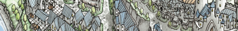
Excellent map, I love the decoration and the overall style.


I like it! (But I am also a big fan of Three Islands Press' typography work.) The whole map is wonderful.
Writer & Designer - kmalexander.com
My FREE historical cartography brushes: Kensett, Zuodong, Ishikawa, Hyacinth, Ende, Homann, Zatta, Janssonius, Vischer, Braun, Ogilby, Van der Aa, Gomboust, Harrewyn, Popple , Donia, Bleau, Aubers, L'Isle, Widman, Walser, Lumbia, Lehmann, and Moronobu Gansai, Mokuhanga, also de Fer Cartography, Battlefield, Settlement
Excellent map, I love the decoration and the overall style.
View my map and asset packs on CartographyAssets or DrivethruRPG. Support my work on Patreon. Take a look at my work on my Website or Instagram.
Great map! I once again love the look of your cities and the whole map is very consistent.
Its absolutely incredible! I love taking my time and looking through every single little detail on it. And theres SO much detail! Haha. The colors are so nice and even though Im looking at it digitally, it just feels like something I could be holding on my hands. Your lineart is so beautiful too. Honestly looking at this map just makes me wanna make more maps, haha <3
No idea how to make this look pretty, lol ignore me
Commissions open! https://vgen.co/JulieJubz or https://ko-fi.com/juliejubz/commissions


Honestly, finding anything decent to pair with fraktur types is something I struggle with quite a bit. I've usually ended up pairing fraktur with fraktur when I've used them. My favourite ones are almost all from Peter Wiegel, he's got a ton of amazing fonts including a good number of fraktur ones.Originally Posted by Arcane Atlas

Funnily enough, I think you actually have a nice combo in here already: I really love how this script looks with the blackletter font. Don't know how much sense it makes thematically, but my eye really likes these two together.

It's crazy, this map is wonderful. Congratulations!