Results 1 to 10 of 10

Thread: The Favourable Wind Archipelago

  1. #1

    Default The Favourable Wind Archipelago

    Looking for escapism and adventure ? Fine !

    Let's sail to the Favourable Wind Archipelago !

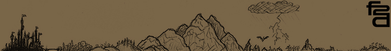
    I wanted to get back to more traditional maps with this personal piece.

    It's mainly something I did for pleasure, improvising along the way.

    Made with Corel Painter 12 and Inkscape for the labels.

    I hope you'll like it !

    EDIT: Updated version of the map uploaded on 12/03/2020 and featuring more natural colors.
    Attached Images Attached Images
    Last edited by Marc Moureau; 12-03-2020 at 10:08 AM.
    My Website
    You can also find my work on :

    Twitter . Instagram . Artstation . Behance

  2. #2
    Guild Artisan fol2dol's Avatar
    Join Date
    Apr 2016
    Location
    Montreuil, FRANCE
    Posts
    542

    Default

    Sublime!!!

  3. #3

    Default

    Lovely work on the mountains, and I think the use of a white coast border works really well.
    Current Project: The Low Countries & Their Periphery, c. 1584

    Do you like Renaissance and early modern history? Check out my Facebook page, Renaissance Netherlands with Will Phillips.

  4. #4

    Default

    Marc, you've really outdone yourself on this one. The mountains are lovely, the colors are vibrant and lush, the details are fantastic, and the border is thoughtfully designed. I love it.

  5. #5
    Guild Expert Eilathen's Avatar
    Join Date
    Aug 2007
    Location
    Kurald Liosan
    Posts
    1,336

    Default

    I like it overall. The land parts are very lovely, top notch mountains and the coloration is also very good. I'm not sure i like the sea part, especially close to the coasts, with the darker parts and the white "wave-line". It's a bit distracting, imo.

    Is there any chance you have a higher resolution of this and would be willing to share it? I'd love to be able to zoom in more to see all those glorious land-details.

    Once again i have to ask: what is it with all those super talented french mappers??!!!! I don't get it
    I'm trapped in Darkness,
    Still I reach out for the Stars

  6. #6
    Guild Master Facebook Connected - JO -'s Avatar
    Join Date
    May 2016
    Location
    Geneva, Switzerland
    Posts
    2,844

    Default

    Very nice work on the light, with the shadows and the choice of colors.
    I really like the coherence between the lineart, the names and the frame.
    The whole map is eyecatching (and a very good choice of font too!).
    Congratulations and thanks for sharing !

  7. #7

    Default

    I really like the feel of this map, Great work!
    My favorite are the mountains, they have a very unique style to them.

  8. #8
    Community Leader Kellerica's Avatar
    Join Date
    Nov 2014
    Location
    South Scotland (originally Finland)
    Posts
    2,807

    Default

    Wow, the way you painted the mountains and forests is absolutely amazing. So soft and subtle. I'll have to agree with Eilathen on the sea part, though - it's not that it looks bad, because it really doesn't. I just think the really strong white outline is a bit harsh-looking, and while it's good on its own right, it maybe doesn't really go with the softer look the landscape itself has. Just my two cents, though And once again I'm in love with your borders!
    Homepage | Instagram | Facebook | Artstation
    Just give me liquorice and nobody gets hurt.

  9. #9
    Guild Journeyer TimetoDraw's Avatar
    Join Date
    Feb 2020
    Location
    N.Ireland
    Posts
    242

    Default

    Really unique look. That border especially is really elegant and interesting. Impressive map!

  10. #10

    Default

    Quote Originally Posted by fol2dol
    Sublime!!!
    Quote Originally Posted by Will Phillips
    Lovely work on the mountains, and I think the use of a white coast border works really well.
    Quote Originally Posted by jshoer
    Marc, you've really outdone yourself on this one. The mountains are lovely, the colors are vibrant and lush, the details are fantastic, and the border is thoughtfully designed. I love it.
    Quote Originally Posted by Ukhsen Khaan
    I really like the feel of this map, Great work!
    My favorite are the mountains, they have a very unique style to them.
    Quote Originally Posted by - JO -
    Very nice work on the light, with the shadows and the choice of colors.
    I really like the coherence between the lineart, the names and the frame.
    The whole map is eyecatching (and a very good choice of font too!).
    Congratulations and thanks for sharing !
    Quote Originally Posted by TimetoDraw
    Really unique look. That border especially is really elegant and interesting. Impressive map!
    Thanks a lot for the kind words ! I started this one for fun, experimenting with different things on the go, so I'm really glad you enoy it.

    Quote Originally Posted by Eilathen
    I like it overall. The land parts are very lovely, top notch mountains and the coloration is also very good. I'm not sure i like the sea part, especially close to the coasts, with the darker parts and the white "wave-line". It's a bit distracting, imo.

    Is there any chance you have a higher resolution of this and would be willing to share it? I'd love to be able to zoom in more to see all those glorious land-details.

    Once again i have to ask: what is it with all those super talented french mappers??!!!! I don't get it
    Quote Originally Posted by Kellerica
    Wow, the way you painted the mountains and forests is absolutely amazing. So soft and subtle. I'll have to agree with Eilathen on the sea part, though it's not that it looks bad, because it really doesn't. I just think the really strong white outline is a bit harsh-looking, and while it's good on its own right, it maybe doesn't really go with the softer look the landscape itself has. Just my two cents, though And once again I'm in love with your borders!
    Thank you very much ! I agree with both of you. I used this map as a playground between other projects, trying different ways to draw mountains, forests and shores. I've been tempted to change it before posting, but making mistakes is still the best way to learn. I think I'll go for something simpler and more natural in the future...

    By the way, the original resolution is way higher. Sharing smaller versions is just a way to protect my work. I hope you understand.

    Thanks again for your valuable feedback !
    My Website
    You can also find my work on :

    Twitter . Instagram . Artstation . Behance

Posting Permissions

  • You may not post new threads
  • You may not post replies
  • You may not post attachments
  • You may not edit your posts
  •