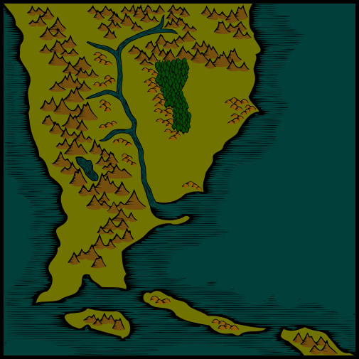
Basic mountains are finished. Forest is next.
I'm not going to worry about the mountain/land interface issue until later in the project.
And then there were trees. I also fixed the lake so that it's style more closely matched that of the river.
I have to say that thetrees are the first thing about your map I do not like. They seem too "canned" and cut-n-paste, which differs from the rest of the richness of the map. Although the perspective style may be appropriate since the mountains are likewise, the actual lack of variety and simplicity of the tree shapes is a bit weak, IMO. At the very least I'd add some crosshatching shadows to the forests to add interest.
I hope the criticism helps--this really is a great map!
PS: Have some rep for keeping this map going!
Don
My gallery is here
__________________________________________________ _______
"Keep your mind in hell, but despair not." --Saint Silouan [1866-1938]
I like the crosshatch shadow idea that Pyrandon mentioned. It gives a little depth and character to the forests.
I have to say that I love the way you did your mountains. They look great and unique which is hard to do when you are using symbols.
I'll try the crosshatch idea, and maybe some other stuff.
It's actually amusing in that the forest is the first part of the map that actually has been cookie-cutter.
Hills have been added. Also, between the last map update and the most recent I mucked around with the forests.
Note, this "mucking around" does not take into account the earlier comments regarding the forests looking too cut and paste.
Here's a potential solution to the forests looking too "cookie cutter." I've deleted the other forests but will re-place them with the new technique if I decide I like it. If this still looks too cookie cutter, my next move is to hand-draw the forests and scan them in.

I really like the way this is coming together - great work!