Welcome to the Challenge Samuel! The linework is great! I believe your map will be very well recieved even if you chose to not add color . But I am a sucker for color, so I hope you do get the chance to bring it to life!

Hello everyone!
This is the first time I'm really posting on here, so I am a little nervous. There is such an abundance of talent here.
Lore:
The map I decided to draw for this is placed in the Sky, my space-sailing setting. Like many islands and moons in the Sky, Il-Theon observes non-converging gravity, which means its gravitational pull isn't tied to its mass in any way. That makes it suitable for life though it did not evolve native wildlife. Humans (and other sentient races) were first introduced to the island through colonisation, and they brought some flora. Most of the island is still covered by rocky or sandy deserts, though Gailesburgh has shown interest in developing it into a self-sustaining colony to further their imperialist expansion.
Progress:
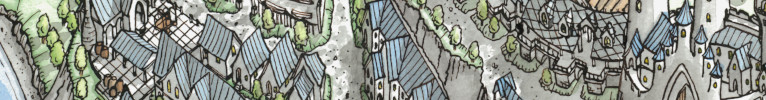
The lineart for the map is done, though I could still clean it up here and there. I will still add shading, labels, and generally beautify the border and such. Maybe add some illustrations in the corners, that sort of thing. I'm not sure about adding color yet, what do you think?
### Latest WIP ###
Il-ThaonSmaller.png
I do all of my mapping in Clip Studio Paint, with occasionally moving to Photoshop, which is exactly what I've been doing for this map.
Cheers,
Sam
Last edited by samuel.harven; 07-01-2021 at 02:19 PM.
Welcome to the Challenge Samuel! The linework is great! I believe your map will be very well recieved even if you chose to not add color . But I am a sucker for color, so I hope you do get the chance to bring it to life!
My Battlemaps Gallery http://www.cartographersguild.com/al...p?albumid=3407
That looks amazing! The linework is great (quoting Bogie)! The engraved pillars at the back are really cool as well.
Beautiful job. I love the wind-eroded structures in the north.
Visit my business site: The Elderly Cartographer
For commissions: Fiverr
Follow me on Twitter, Instagram, Pinterest, and DeviantArt
That is some pretty solid work. With Mr. B on this, would love to see some color for this, maybe something a little subdued so it doesn't draw too much attention away from the line work.
GW
One's worth is not measured by stature, alone. By heart and honor is One's true value weighed.
Current Non-challenge WIP : Beyond Sosnasib
Current Lite Challenge WIP : None
Current Main Challenge WIP : None
Completed Maps : Various Challenges
This is looking great so far. I really like the variety of elements on the landmass, the setting sounds really interesting too.
View my map and asset packs on CartographyAssets or DrivethruRPG. Support my work on Patreon. Take a look at my work on my Website or Instagram.
Thank you for the feedback!
I went ahead and added some color, as you recommended. Did it in a bit of a watercolour style, which I have used before for some other maps. I tried doing something a little different with the purple in the west. What do you think of that? What of the rest of the colour palette? I still need to do the cities and labels, but I think I'll redo the city lineart. It's not as nice as it could be, I don't think.
### Winner ###
DesertIslandUpdate1.png
I'm still looking for a high quality watercolour paper texture, I couldn't find any free ones...
Last edited by ChickPea; 09-05-2021 at 04:31 PM. Reason: Added Winner tag
So very nice and the color addition is deftly handled.
The color looks great!
My Battlemaps Gallery http://www.cartographersguild.com/al...p?albumid=3407
It is very appealing to the eye. I'm not sure how to interpret the terrain of the purple land with it being purple, but I would not change it. The colors blend so wonderfully and compliment each other so well. Also I like the runes on the large blue crystal.
Visit my business site: The Elderly Cartographer
For commissions: Fiverr
Follow me on Twitter, Instagram, Pinterest, and DeviantArt
 Posting Permissions