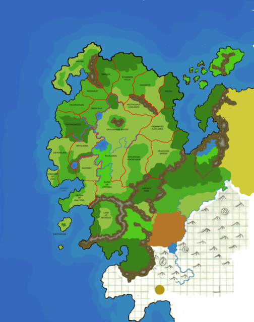
Page 1 of 2 12 LastLast
Results 1 to 10 of 658

Thread: [Award Winner] Using GIMP to Create an Artistic Regional RPG Map

Hybrid View

Previous Post Previous Post   Next Post Next Post
  1. #1

    Default

    Post 14: Cities
    At this point, you can spend some time playing with colours, saturation, different overlays, etc. to get the land looking the way you want. Once all that is time, it is time to start detailing the non-terrain elements of the map. If you have an idea where cities and roads are to be located that is great. If not, here are a few suggestions:
    • All settlements need water - fresh water for drinking and agriculture.
    • Communities usually have a reason/industry for existing in the first place – farming, mining, shipping, commerce, defense etc. This purpose is often tied to natural resources in the area.
    • Accessibility is important for communities to interact with the world, and people will take the easiest path possible, not the shortest path. Water is one of the easiest ways to travel.

    Once you have a mental idea of where you want settlements and roads, start adding them. I have found the simplest way to make cities is using dingbat fonts. The one installed on every windows machine is called “wingdings”. Here is the character map for wingdings generated by a free Windows font manager called “The Font Thing”. (You can get the link by searching in the forums.):
    Click image for larger version. 

Name:	post14-1.png 
Views:	8741 
Size:	57.4 KB 
ID:	1526

    As you can see, there are some nice symbols for mapping here, depending on your map style. Using a font manager will let you find these easier. For this tutorial, I will use some similar characters to indicate settlements; I will use the symbol that looks like a ship’s wheel (“]”)to indicate ports, the little square cloverleaf (“z”) for walled settlements, and the simple dot (“l”) for all others.

    Create a new transparent layer called “Towns”. When using GIMP’s text tool, it creates text on new layers above the currently selected layer, but we will be merging all of them down to the “Towns” layer. Select the Towns Layer, and click on the text tool. Pick the font Wingdings. You can leave the colour the default (black) or pick a different colour now. Click in the general area you want a town marker:
    Click image for larger version. 

Name:	post14-2.png 
Views:	3705 
Size:	697.5 KB 
ID:	1527

    You can change the text size, alignment, spacing and such at this time. Notice the new text layer created in the layers dialog. Selecting the Move tool and toggling “Move the Active Layer” will allow fine positioning of the icon. This process can be repeated with as many icons desired.
    Note: I have not found a way to get non-keyboard symbols into GIMP text. In other Windows applications you can hold the alt key and type the keycode (like ALT+177 to get the crosshair dingbat). Cutting and pasting from another application into the GIMP text dialog does produce non-keyboard fonts, but not what you would expect.
    Once this is done, all the icons will sit on their own layers. (I used a smaller size for the solid dots as they looked too big at 22px):
    Click image for larger version. 

Name:	post14-3.png 
Views:	875 
Size:	30.8 KB 
ID:	1528

    Now merge all the text layers down into the town layer. This can be done one at a time right clicking the layer and selecting “Merge Down” or by turning off all the other layers and selecting “Merge Visible Layers”. (I added a keyboard shortcut via File->Keyboard Shortcuts to make Alt-m merge down to speed up this action.) You should end up with all the text layers gone, and just the “Town” layer left.

    The colour can be changes very simply at this time by checking the “Lock Alpha Channel” checkbox. You can then just drag colours (or patterns, or paint with tools) from the Palette Dialog, and all the transparent areas will remain transparent!
    Click image for larger version. 

Name:	post14-4.png 
Views:	2753 
Size:	732.2 KB 
ID:	1529

    Create a new layer below Towns called “Towns Outline”. This layer will be used to help the town icons stand out. Right click and Alpha to Selection on the Towns layer. Enlarge the selection by 2 px or so (Selection->Grow) and optionally soften the selection (Select->Feather). I used 5 px on the feather. Now with the Town Outline layer active, drag black (or a contrasting colour to the town icons) to the screen. Lock the transparency.

    With both layers having transparency locked, you can drag different colours, or play with the colour adjustments (hue, saturation, lightness) and layer blending modes. Here I ended up with the icons using the “Roofs 3” colour and the outline the “Roads” colour.
    Click image for larger version. 

Name:	post14-5.png 
Views:	2842 
Size:	710.1 KB 
ID:	1530

    White on black (or vice versa) also work well if set to overlay mode.

  2. #2

    Default

    Post 15: Roads

    Now that you have some civilization, they need to get around. A few things to remember are that people will travel the easiest way possible, even if it is longer. That means that one thing that roads are not is straight (at least in a pre-industrial world!). Even so, roads should be smooth. Trying to draw roads by hand is extremely difficult (especially if you do not have a tablet). My preference is to use paths, and stroke them as desired.
    In truth, I prefer Inkscape for editing paths as I find it easier, and it is very trivial to have a workflow that integrates GIMP and Inkscape. However, this tutorial said using GIMP, so that’s what we’ll use.
    ASIDE TIP: To bring an Inkscape SVG into GIMP as paths, right click on the little triangle in the Path palette to bring up the Path Menu option, then go to Import Path.
    Click image for larger version. 

Name:	post15-1.png 
Views:	867 
Size:	118.3 KB 
ID:	1571

    Just follow the dialog. There are two options at the bottom. Merge Imported Paths will cause all the vectors to be imported as one path. Scale Imported Paths to fit Layer will scale op the extents of the SVG image to fit your gimp image size. If not merged, each path will come from Inkscape as a separate path, so combine (not group) any paths you want to be imported as a single element.

    Once you have decided where your roads go, start drawing them with the path tool. Click on the path tool (pen icon) and to draw curves, uncheck the Polygonal option.
    Click image for larger version. 

Name:	post15-2.png 
Views:	2282 
Size:	663.6 KB 
ID:	1572

    Click on the drawing where you want a path to start (a town) and drag in the direction you want it to go. Then click the next node of the path and drag to set the curve again. This can be continued as long as desires. The edit mode can be used to move and change the handles of notes. It is also worth mentioning that paths can be edited while zoomed in. This makes it easy to accurately set where they are:
    Click image for larger version. 

Name:	post15-3.png 
Views:	1768 
Size:	115.2 KB 
ID:	1573

    Using the path tool will automatically create a new path in the image. Paths are not really visible on an image, but can be turned into selection or stroked with any of the tools. Paths can be made visible by clicking on the eyeball icon (just like layers).
    Paths can even extend beyond the drawing edge.
    Click image for larger version. 

Name:	post15-4.png 
Views:	1217 
Size:	401.6 KB 
ID:	1574

    Once you have all the paths that represent your roads (or all the roads of a particular style) merge them into one path my making them (and only them) visible in the path dialog and right clicking Merge Visible Paths. Then rename this path to “Roads”.
    Click image for larger version. 

Name:	post15-5.png 
Views:	1961 
Size:	402.7 KB 
ID:	1575

  3. #3

    Default

    Post 16: Roads (continued)

    Once the paths for the roads are defined (either using the path tool in GIMP or imported from Inkscape) it is time to actual render them onto the map. There are two main styles for roads – single stroke, and over-stroked. Single stroked roads look like a line (dashed or solid). Over-stroked consist of multiple strokes layered over one another. For example, a wide dark stroke with a light narrow stroke on top will look like a light road outlined in dark. The type of stokes used will be depend on the style you develop, and you might want to use several, along with a legend, to indicate what they represent.
    Here we will make a road similar to that of the ones I used in my Niagara map.

    Create a new, transparent layer below the town layers, called “Road1”. Select white as a colour, and click Edit->Stroke Path (since there is only one path, it is selected as the current path). Choose a width that goes with your map scale (I used 3 px) and pick a solid line with curved end caps. Click Stroke. (I brought the dialog up again after stroking to show the options used).
    Click image for larger version. 

Name:	post16-1.png 
Views:	1885 
Size:	536.3 KB 
ID:	1576

    Change the drawing colour to black and bring up the stroke dialog again. This time, use 1.5 px, and a custom pattern. Draw the dash pattern you want to use. I made it short dashes.
    Click image for larger version. 

Name:	post16-2.png 
Views:	1369 
Size:	527.5 KB 
ID:	1577

    Change the layer blend mode to Overlay to get a nice road that blends in well. Alternately, different colours could have been chosen up front for the roads if you wanted specific colours. I want them a bit darker, so duplicate the Road1 layer.
    Click image for larger version. 

Name:	post16-3.png 
Views:	1478 
Size:	654.3 KB 
ID:	1578

    This looks nice now, but the roads are hard to see in the forest, so lets fix that. (And here is where the power of paths really comes into play.)
    Select the “Forest Bumps” layer, ensuring the mask is selected for editing. Pick the paintbrush tool, with black paint, and a fuzzy brush slightly wider than the road.
    Now again, stoke the path (Edit->Stroke Path) but this time select “Stroke with a paint Tool” and make sure paintbrush is selected.
    This will paint a black line on the bump layer mask to make the road more visible. You could do the same thing to the colour layers as well to define it more.
    Alternately you could stroke with the erase tool to erase areas along a path, or the smudge tool, or anything!
    Click image for larger version. 

Name:	post16-4.png 
Views:	1058 
Size:	561.4 KB 
ID:	1579

    Finally, as an optional step, to make the roads more jittery, I went back and applied a small (3px) displacement map to them (Filters->Map->Displace) selecting one of the noise layers in the drawing. This just makes the roads less smooth, and a bit more hand-drawn. (though it does look better to do this on a single stroke map)
    Click image for larger version. 

Name:	post16-5.png 
Views:	2178 
Size:	478.5 KB 
ID:	1580

  4. #4

    Default

    A small diversion-

    I am working on the next installment, but have been....distracted.

    I just wanted to jump here with a variation of the map used in the tutorial until this point. I changed the colour layers (forest, grass, and mountain) to represent a more autumnal environment. This is one of the advantages I have found in keeping the colour and textures on separate layers...

    Click image for larger version. 

Name:	aside.png 
Views:	2590 
Size:	364.2 KB 
ID:	1693

    -Rob A>

  5. #5

    Info

    I was pm'd with a question on how the TLS works. Here is a sample xcf file you can look at that will explain better than I can (hopefully).

    I have also created and added the mask layer on top, and turned off its visibility.

    -Rob A>
    Attached Files Attached Files

  6. #6

    Default

    Here is a clarification of the overlay mode.. The way overlay works is that anything white in the lower layer will remain white, and anything black will remain black, it is only in the greys that the noise layer will come through and have an effect...

    Here is a sample:
    Click image for larger version. 

Name:	clarification-1.png 
Views:	916 
Size:	130.2 KB 
ID:	1698

    See how the randomness of the coast is restricted to the width of the greys in the blur?

    -Rob A>

  7. #7

    Default

    Post 17: Labels

    It is now time to start labeling the map. Most of the horizontal text will be made using the text tool just like the city icons were done. So I won’t provide the detail here. Just merge all the text down to one layer when happy with its look, and apply an outline glow to separate it from the background. I am going to use the same colours as the cities themselves for most labels.
    One thing to remember is that more is not better when it comes to font text. If there is more than four different fonts then something should be reconsidered. I would suggest one font for most labels, optionally a different, possibly more ornate font for a map title, and a clear small font for labeling rivers, roads, etc.
    Colour in labels can be useful as well, keeping cities in one, territories in another, etc can help make a complex map easier to read.
    I am using a font called Chaucer Ultra-Light for most of my labels. I also duplicated the text layer to make it a bit heavier, and reduced the opacity of the outline to 50%. To make things fit better, I also used different font sizes corresponding to the importance of the city. (Hedge and Il-Lac are both in a smaller font.)
    Click image for larger version. 

Name:	post17-1.png 
Views:	1849 
Size:	724.5 KB 
ID:	1701

    labeling terrain requires a slightly different approach, as terrain labels often follow terrain (for example, labels follow mountain ranges and rivers). For those labels that are horizontal, just do them the same way as the city labels. For others, here is the way to do them using GIMP 2.4, which now supports a “Text along Path” function.
    This does not actually bend the text to a path. Instead, it creates a new path outlining the text that is bent along the previously active path. As an example, lets add a label to the mountains.
    Select the path tool (just like when making roads) and create a new path along the line where the text should go (I have changed to the path dialog as well to show the new path):
    Click image for larger version. 

Name:	post17-2.png 
Views:	1203 
Size:	714.4 KB 
ID:	1702

    Now pick the text tool, and click in the middle of the screen. You can set the font and size, but there is no point setting the colours. Set the alignment to centered, and type the desired text.
    Click on the “Text along Path” button. This will create a new path outlining your text, bent along the first path drawn. If you need to change the text (font, style, spacing) or the path, undo (ctrl-z) and make the changes in the text or path and redo the whole “Text along Path” process.
    Depending on how bendy the path is, the letter spacing might have to be changed to prevent the letters from being either to mashed up or too spread out.
    Click image for larger version. 

Name:	post17-3.png 
Views:	1326 
Size:	763.9 KB 
ID:	1703

    Now in the path dialog, click on “Path to selection” (or right click->Path to Selection). In the Layers dialog, create a new Transparent layer called “Labels” (or what ever you want to call it) and fill it with your desired colour. Here I chose to keep the colours the same as the city labels, but flipped around (light text with a dark outline). Remember you can fill a selection simply by dragging from the colour palette.

    GIMP Note: ctrl-t will toggle displaying the “marching ants” outline around selections. This is handy to see the results of a fill.

    Click image for larger version. 

Name:	post17-4.png 
Views:	781 
Size:	733.1 KB 
ID:	1704

    Now create the outline layer “Labels Outline” below this, and (as for the previous text) grow the selection and feather the selection. Now fill on this new layer with the desired colour:
    Click image for larger version. 

Name:	post17-5.png 
Views:	1479 
Size:	479.6 KB 
ID:	1705

    You can see that the text layer is still there but is not necessary. It is however handy to just reuse this text layer to create any additional labels you want. I tend to put all the labels on one layer, so after getting the text selection, make sure you select the proper layer to fill on.
    Finally, all of the paths used for lining up the text can be deleted (if desired) or keep them in case you need to redo the text later.
    GIMP Note: The transform tools (rotate, move, scale, skew and flip) can all be used on paths as well as layers and selections. This means that if the text isn’t exactly where you want it after putting it on a path, you can move it, rotate it, etc.

  8. #8

    Post

    Hey, this is brilliant. Being the insomniac that I am, I've been playing with this all night. I've never touched anything outside of paint, seeing as I have no artistic ability whatsoever, but this was very easy to follow. I've just hit the mountains and have run out of steam for now - but wanted to let you know that from a total newbie's perspective, this is a very well written tutorial.

    E

  9. #9
    Guild Member heathan666's Avatar
    Join Date
    Oct 2008
    Location
    Does Hell actually have an address???
    Posts
    89

    Post

    ok my first attempt at layering...I'm not happy with it, but hey first time this is actually a world map for my 4th Edition game, I got alot of stuff I have to add, I can only hope that I make it look as good as your stuff does there man. Its still a work in progress but here's a before and after shot...lol...I think I need to redo the mountains......just delete and start from scratch.

    BEFORE TUTORIAL:


    AFTER TUTORIAL:

  10. #10
    Guild Artisan Facebook Connected
    Join Date
    May 2008
    Location
    Atlanta, Georgia, United States
    Posts
    928

    Post

    Quote Originally Posted by heathan666 View Post
    ok my first attempt at layering...I'm not happy with it, but hey first time this is actually a world map for my 4th Edition game, I got alot of stuff I have to add, I can only hope that I make it look as good as your stuff does there man. Its still a work in progress but here's a before and after shot...lol...I think I need to redo the mountains......just delete and start from scratch.


    Just wanted to point out: it looks like your coastline changed a bit from the original version to RobA's GIMP Tutorial Version. I imagine this is due to the fractalizing the coastline steps right in the beginning: i.e. using the 3-layer-sandwich and the cloud fill to make a rough and jaggedy coastline.

    I thought I'd mention that if you were particularly liked your old coastline (which already looked reasonably jaggedy and fractalized, imho), then it's perfectly possible to sort of skip these early steps on RobA's tutorial and move to the later steps (the sea, etc.) To do this, however, you'd need to convert your existing coastline into a black-and-white layer (white land, black ocean).

    You can do this several different ways, probably. It looks like you already have a black line for the coast. You can probably use the Wand-select tool to select the ocean and, on a new layer, fill it with black. (You should be able to select all the ocean blues by changing the settings on the wand tool.) This should fill black up to the same point at which your coastal line begins. Then, you just invert your selection and fill the rest with white. If you've done this all on a different layer, you'll still have the original you can use as a guide.
    I think, therefore I am a nerd.
    Cogito, ergo sum nerdem.

    Check out my blog: "The Undiscovered Author"
    It's the story of a writer... follow me in my simple quest to get published, and share your own writing stories, adventures and writerly tips.

    Pimping my worldmap here. Still WIP... long way to go, but I'm pretty proud of what I've done so far...

Page 1 of 2 12 LastLast

Posting Permissions

  • You may not post new threads
  • You may not post replies
  • You may not post attachments
  • You may not edit your posts
  •