Reply With Quote
For the water, maybe you could go with a larger area of blue all around the lands, with the blue being gradually faded to the background? I think this could convey your style. Good job by the wayOriginally Posted by tainotim


I'm with ChickPea, I dig your overland map style Tainotim. This is charming. And I like the simplicity of your route symbols. Looking forward to seeing the completed version.
Cheers,
-Arsheesh
For the water, maybe you could go with a larger area of blue all around the lands, with the blue being gradually faded to the background? I think this could convey your style. Good job by the way
Big thanks friends! I will try it out Max, see how it turns out
Cheers,
Tainotim
Experimented a little more, not sure if it's better or not. It's definitely different.
Any thoughts?
Cheers,
Tainotim

Last edited by tainotim; 01-13-2016 at 02:55 AM.
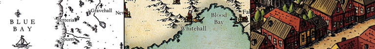
A small update (Haven't had much time). Think I'm happy with the coloring, and started with some labels. In the past I have erased around the labels to make them show better, but here I have tried a slight glow effect to avoid that. Not sure if it's legible enough this way
Cheers,
Tainotim

Just amazing tainotim. Have always been in love with your cities and now also these world maps are of an, to me at least, excellent style. Will definitely use it for inspiration in the future
Cheers,
Barek
I'm allergic to pollen! - Amaranthus hypochondriacus
The colors are excellent, very appropriate. I would add some dots to your sea roads, they are a bit too spaced, especially compared to the land roads.
Big thanks Barek and Ilanthar, means a lot! I haven't had time to finish this one, but I'm almost there. Hopefully I will have time to wrap it up this month
Cheers,
TAinotim
I don't have much to say except: I like this a lot!
Latest complete maps: East Wickham | Oghura | The Cathedral Galaxy | Jezero
hand-drawn maps album | digital maps album | web site | blog


Really nice job, like the subtle color palette. Two small island on bottom left corner, look like they haven't been colored in, may be on purpose, but just wanted to call out. Nice job.
 Posting Permissions