Reply With Quote
Great work. I absolutely love the colored version! Thanks for sharing the author's initial version too. It's really interesting to see what you made of it.

Amazing piece! Love the colors, though the grayscale version looks great as well!
-Dan
Great work. I absolutely love the colored version! Thanks for sharing the author's initial version too. It's really interesting to see what you made of it.
Map is not territory...
Current work in progress:Korobrom | My finished maps
My DeviantArt site and Twitter


First, thanks to everyone for the comments and feedback.
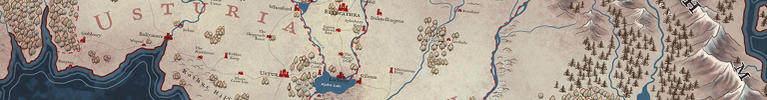
The choice to use red came from seeing so many maps use the same color schemes. That orange/blue/green look. The maps are beautiful for sure, but I wanted to move in a different direction with this. And I had just done a map with that color scheme at the authors request. I try and never do the same thing each time. Save with mountains. I do love drawing mountains like that.
A little insite to how I approach maps.
Maps are never really an accurate representation of a given world. To me, they are encoded visual information. For example, no one ever has issues with the size of the cities. We all know those are just symbols to represent location. Same with the trees. They would be way to big to be considered "realistic"
And I know that for a lot of people, they follow rules, such as if you are doing an isometric map, everything follows a rule, perspective that unifies it into creating the illusion of 3D. And they are right if that's how they want to express themselves in their maps.
I don't necessarily follow that strictly. I could just as well use stylized symbols for the mountains. But I like how I draw mountains. But depending on the type of map, I don't always draw mountains the same. For the Wake of Vulture books, I drew symbols to represent the mountains, because the map was based on the kind of maps you would see in 1850s, wild west.
So with the rivers, I wasn't looking to give them depth, but to soften them. The same "shading" around them is the same along the coast line. Before I added them, I didn't like how skimpy they looked.
I believe in both restrictions, and breaking restrictions when it comes to being a visual artist. You just have to understand the rules before you break them.
So when I draw, I consider all that. I certainly have preferences in how I want to draw things. And sometimes I get requests for specific things. The current map, the author loves all my tiny trees, and apologized that half the map spread was all trees. While that's a lot of work, different parts of the huge forest have different names, which will allow me to add some visual interest to the forest, drawing different trees to represent the flavor of the name of that area.
Last edited by TimPaul; 09-14-2016 at 10:18 AM.
Thanks for the answer Tim, it's always really nice when artists share their views on a topic, it always opens a new way to look at maps.
have some reputation!Originally Posted by thomrey

If being critic gets me some rep, I'll put my nitpicker coat more often ! Thanks
Very nice map (again)! And... no, no nitpick this time.
BTW, here are printer proofs of the cover for the book.
And part of the reason why I chose the colors I did!
TIE IN, BITCHES.
And when I type BITCHES, I only mean it as a compliment.