


the highlighting around the dark gray text on a light gray background makes it very hard on the eyes to read
maybe a bit of tone changes ?
-- example :

I thought I'd give this a shot. I think I might have the scale on the lighting a bit off, but I'll try again later.
### Latest WIP ###

the highlighting around the dark gray text on a light gray background makes it very hard on the eyes to read
maybe a bit of tone changes ?
-- example :
Last edited by johnvanvliet; 04-03-2017 at 03:45 PM.
--- 90 seconds to Midnight ---
--------
--- Penguin power!!! ---
I'm so glad you decided to put the Guild City invisible island on the cover
Free parchments | Free seamless textures | Battle tiles / floor patterns | Room 1024 - textures for CC3 | GUILD CITY INDEX
No one is ever a failure until they give up trying
Welcome to the Challenge Waldronate! The yellow is a bit bright, but maybe it will look ok on a map background.
My Battlemaps Gallery http://www.cartographersguild.com/al...p?albumid=3407
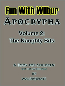
The yellow border with the black text was supposed to be reminiscent of a product logo or something. I think that I may have the lighting worked out. Now it looks more like a bad geography textbook cover.
### Latest WIP ###
The original was twice this resolution and not suffering from JPEG artifacts.
Last edited by waldronate; 04-04-2017 at 01:50 AM.
I think its quite beautiful, really. I love crinkly land textures
Free parchments | Free seamless textures | Battle tiles / floor patterns | Room 1024 - textures for CC3 | GUILD CITY INDEX
No one is ever a failure until they give up trying
If I get more ambitious, I might go with lots of little blocks of styles in the manner of the background on the Wilbur download page. There were only 4 blocks because there were once only 4 styles to see. There are a few (dozen) more, now. The full-resolution, 15.5MB view can be found at https://www.dropbox.com/s/xm61zejaec...r_max.jpg?dl=0 if you want to burn some bandwidth and have a dropbox account.
For best results, I need to figure out what font I used for the Wilbur logo 20+ years ago. The online font matchers really don't seem to like disjoint glyphs.
"The naughty bits"
Who knew Wilbur could be so much fun?!
"We are the music makers, and we are the dreamers of dreams"
Once you get under the covers, who knows what you'll find?
I tried but I never been able to do somethink with Wilbur, so I admire your work ! Will you do something with the yellow border ?


