Reply With Quote
Wow, the client must be over the moon... i would be. Great illustration Daniel. hats off

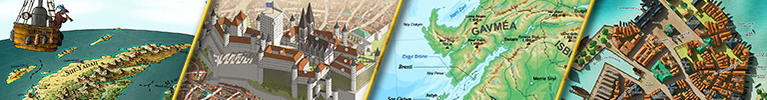
Some time ago Thomas kindly pointed out to me that author Brandon Berryhill was looking for someone to design a steampunk-styled flying ship for him. This is the same client that Thomas did the Ruin map for.
Brandon was a great client to work with, and I really enjoyed working on this project. I had never really done a steampunk styled map before, and it took some experimenting, before I finally settled for a style. So yeah, the map.
Behold: The Liberator, a flying ship. I think the map is very self-explanatory, not much to add.
© Daniels Maps 2017 - All rights reserved
As always, let me know what you think!
Last edited by DanielHasenbos; 01-10-2018 at 05:25 AM.
Wow, the client must be over the moon... i would be. Great illustration Daniel. hats off
New Horizons
Fantasy maps and illustrations.
All my non-commisioned maps are FREE for personal use. Get them at my home page New Horizons
Get more of my maps by becoming my Patreon.
Support:
Patreon | Tip via PayPal.Me | Buy Me a Coffee


I reached out for this one too, but alas never even heard back, but it's nice to see such a fine piece produced for it.
Beautiful job on this, Dan. Great steampunk touches and grungy touches!
What font did you use out of interest? Finding lovely looking commercial fonts can be a right pain sometimes.
Great to hear you got the job DanielThat's our second time working on the same world. The map is marvelous, clean and elegant. A little thing I spotted. The font you use seems to not have the tick like in "captain's".
Nice and elegant map, Daniel! Do I see some gatlings on top of the balloon? If it's the case, that seems like a dangerous option...
Nothing is better than guns to spread some freedom.
Great map
My Deviantart: https://vincent--l.deviantart.com/
Cool map ! Cool ship !
Great job !
This is amazing! You've done a great job!
Francesca Baerald - http://www.francescabaerald.com/maps/

Great image Daniel! I love just about everything about it, even the cog wheels you used for labeling. That one is an inspired choice! Artwork all over is just splendid. Wanted to rep you, but seems I'm all out!
Caenwyr Cartography
Check out my portfolio!
Dang, I forgot to comment on this before!
What a beauty. The muted, clear color scheme creates a harmonic atmosphere, that the subtle illustrations in the background compliment beautifully. I also really love that title/logo - kudos on the font choice, I remember you mentioning it on Discord
A gorgeous piece all in all, well done. Can't rep you though, you make too much great stuff!
 Posting Permissions