Reply With Quote

This is gorgeous! I love the painterly style in the coloured version. The forests are wonderful! I absolutely adore how they look. The black & white version linework is gorgeous too.
Excellent work all round!

Many of the maps I've worked on this year I've not been able to share as the novels and projects are still being worked on. This particular trilogy is approaching release so I can now share it.
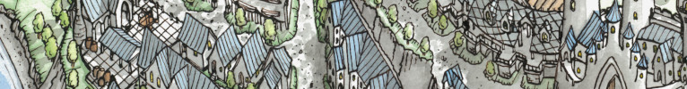
This was a map for author Michael Warden for his fantasy trilogy "The Pearlsong Refounding", commissioned back at the start of the year. This is actually a rerelease of the trilogy and so I couldn't change the landscape too much (the original map posted at the end of this post).
They wanted an intricate border, similar to my Fidelity of a Snake map, and I must say I've been getting so many requests for borders these days since then and loving pushing myself with each one. The main things that needed to be included was a staff crucial to the plot and some text in the books conlang. The conlang didn't have a script and so developing a conscript for this was also part of the commission, which I did really enjoy doing. Lions were also and important to a later plotpoint so after a few concepts back and forth of refining we settled on the final design, with some small vignette modifications when it came time to make the coloured version.
And the map from the original book that I worked from along with passages and descriptions provided by the author to fill in some of the blanks

Last edited by Ifrix; 09-11-2023 at 06:39 AM.
This is gorgeous! I love the painterly style in the coloured version. The forests are wonderful! I absolutely adore how they look. The black & white version linework is gorgeous too.
Excellent work all round!
"We are the music makers, and we are the dreamers of dreams"
Awesome!I really like this.
Makes me wonder, what dimensions were needed to make this fit properly in the novel?
~ Maps-DriveThruRPG ~Free Maps and Assets ~Current Project~
My web novels
Instagram handle: instagram.com/omrihope
-------------------------------------------------------------------------------------------------------
~The heavens declare the glory of God;
the skies proclaim the work of His hands.
Day after day they pour forth speech;
night after night they reveal knowledge.
~ Psalm 19


The new version is so beautiful ! Congratulations for such a nice job !
Looks great, but I love black & white version more!
Gotta say, Alastair, this one was a knock out for me ! The black and white version was wlready a stunning piece of art but what you did with the colors is a whole other level of awesomeness. I love the fact that you changed the border between B&W and color and am curious as to why, I love the texturing of the land and the eastern broken plateau is something to behold ! Great job all around
Well that's some very different lands! Joke aside, splendid map & frame. Both B&W and colored versions are very efficient and gorgeous.
Great map, both the black and white and colour versions are fantastic. The border especially is very nice.
View my map and asset packs on CartographyAssets or DrivethruRPG. Support my work on Patreon. Take a look at my work on my Website or Instagram.

Very nice work. The addition of the Dunerun Hope and the Black Gorge imagery, with the improved river delta at Morguen are real improvements. The colored version adds even more interest with the color differences between the lands on either side of the Black Gorge. Overall, the new maps makes me want to read the books. I am curious though, why there isn't a map title as in the original? Thanks for sharing this with us.
Last edited by Ed Erfurth; 09-15-2023 at 08:59 AM.
Thanks for all the comments and rep!
The piece is 12" by 9" at 300dpi, intended for a double-page spreadOriginally Posted by XCali

Purely just a request from the author, they wanted a little variance between the 2 so they could have the promotional colour version be slightly different and show off some book locations/features.
I went back and forth with a few designs for the border, some with the title and some without and the client determined that the actual name of the land itself wasn't as important as the contents of the land so we moved to a design more focused on ornamentation.
Not a map, but the client also commissioned a couple of creature sketches too to be used for promotion and on their website, done in a sketchy ink style.

 Posting Permissions